The Challenge
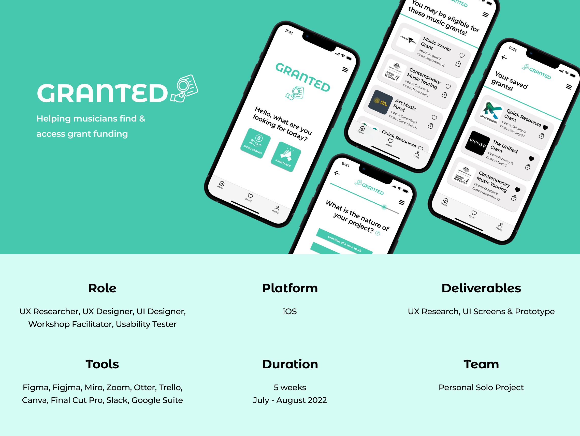
The rationale behind this project was to design a solution that helps musicians with financial instability. Through extensive UX research, I discovered that musicians want more support and funding, but many of them aren’t utilising grants as a means of support. This prompted me to investigate why this is, and to design a relevant solution to assist musicians in this area.
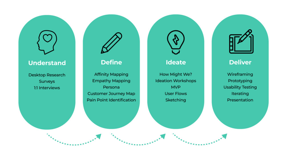
My Design Process
The Solution
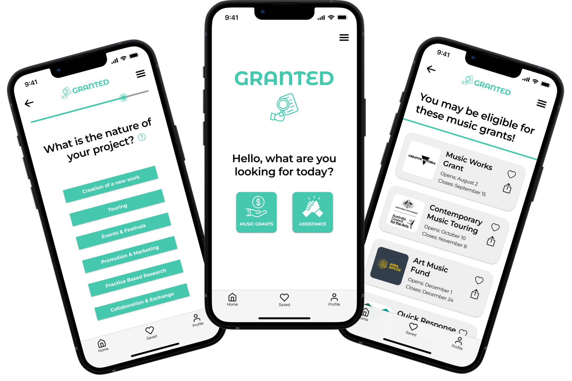
Through undertaking an end-to-end process, I designed and tested a mobile app based on research insights, which helps musicians search and apply for grants.
Dive Deeper Into The Journey
That Led To My Solution
Project Background
Overview
As part of my UX/UI course, I worked on a personal project to apply my learnings in a practical way. The rationale behind this project was to design a solution that helps musicians with financial instability. I chose this problem space because it’s an area I’m passionate about having worked in the music industry for the last 10 years. This was a daunting undertaking as it was the first UX/UI project I had executed, but it was extremely rewarding and it showed me the importance of letting the research guide you and how empathy is vital in the UX process.
Outcome
When I initially scoped the project, I assumed I’d be designing an application to help music workers with their taxes, or even a time management application to help them with balancing their music work with their non-music related work. I couldn’t have been more wrong. In the end, I followed the research and the double diamond process, and my findings indicated that music workers desire more support and funding, and that they aren’t utilising grant funding.
Through undertaking an end-to-end process, I designed and tested a mobile app based on insights and data gathered through extensive user research. The end result is “Granted”, a mobile app which helps musicians access grants.
Initial Problem
Statement
“Musicians are tired of having to work multiple menial jobs (in addition to their music work) due to a lack of financial stability in the industry. They want appropriate remuneration and job security for their music work but this is an industry-wide issue without an easy solution.”
The Process
Discover, Define, Develop and Deliver…. Iterate!
- Weeks 1 & 2: Research and synthesis.
- Week 3: Ideation workshop and identifying solutions.
- Week 4: Sketching, creating user flows and low fidelity wireframes. User testing and building into mid fidelity prototype.
- Week 5: Usability testing and delivery of high fidelity prototype
User Research

Desktop Research
My desktop research gave me a foundational understanding of the problem space, and the findings informed my survey questions, which I used to get a clearer idea of what sort of problems music workers are facing everyday, who is facing them, and how this is affecting them.
47%
of Australian music performers/creatives earn less than $30,000 per annum
66%
of Australian music workers reported high/very high levels of psychological distress
47%
of Australian music workers lost their job during the pandemic
Survey Insights
As the survey responses began to come through, I noticed a common thread – a lack of funding and support for music workers.
It shocked me that whilst 88% of music workers have had to NOT go ahead with projects due to lack of funding, 100% of music workers are aware of grants and 1/3 of them had never applied for one before.
75%
of respondents were 25-34 years old
96%
work other jobs in addition to their music work
95%
have been underpaid or have worked for free
88%
have decided to forego a music project due to lack of funds
100%
of respondents were aware of music grants
33%
have never applied for a grant
1:1 Interview Quotes
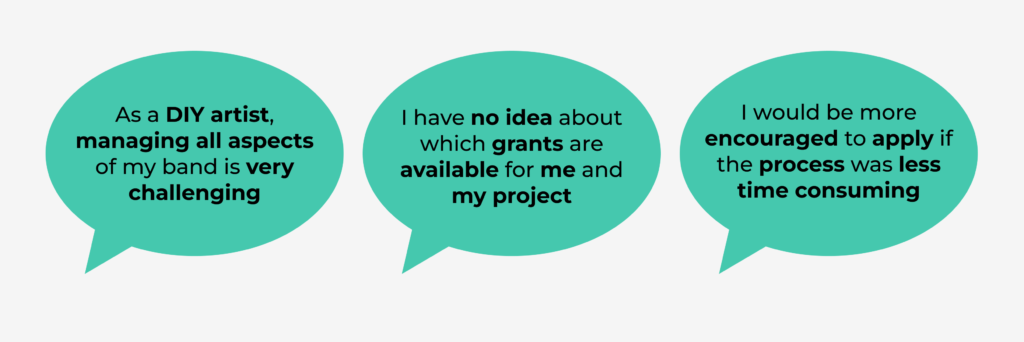
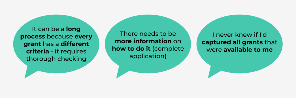
From here, I narrowed the scope of my interviews to probe more around grants and funding. 1/3 of my respondents had never applied for grants before so I was particularly interested in why so many musicians hadn’t utilised these resources. Here are some direct quotes:
Pivot Moment
Rather than focusing broadly on musicians facing financial instability, and having probed more around why musicians aren’t accessing grants, I decided to focus on a recurring theme that kept emerging in my research – musicians want more access to funding & support, and the grant searching process is a significant barrier.
Revised Problem Statement
“Financially unstable musicians are frustrated with the meticulous process of finding grants. They want easier access to grants, but the grant searching process is tedious and confusing.”
Key Insights
- Musicians are foregoing projects due to financial reasons.
- Musicians feel there is a lack of funding and support for them.
- Musicians are aware of grant applications, but 1/3 of them aren’t applying.
- Musicians are time-poor due to having to work non-related music jobs to supplement their music income.
- Musicians spend a lot of time searching for grants but they are still unsure of which grants they’re eligible for.
- Musicians find the grant application process drawn out and confusing.
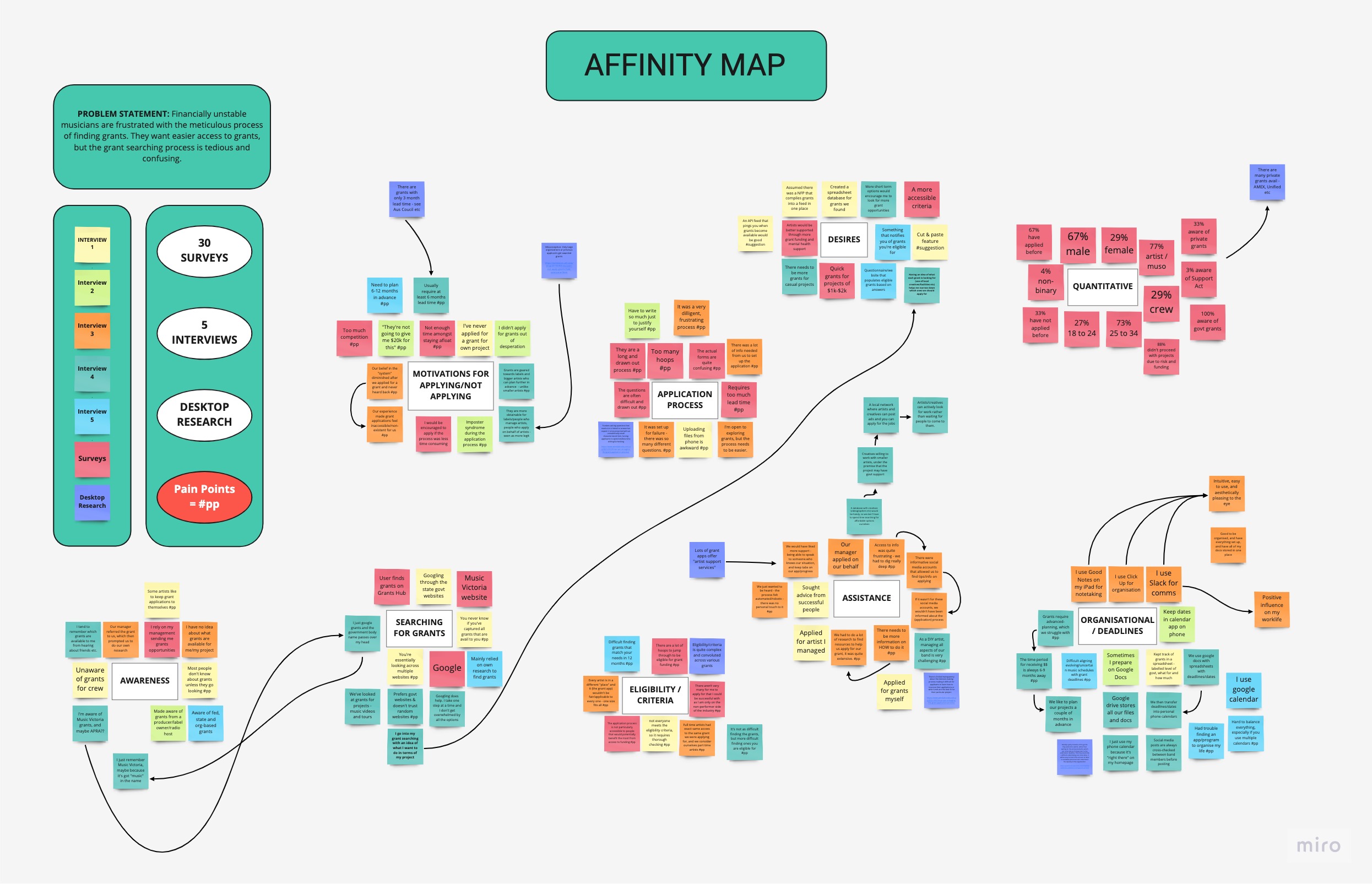
Synthesis
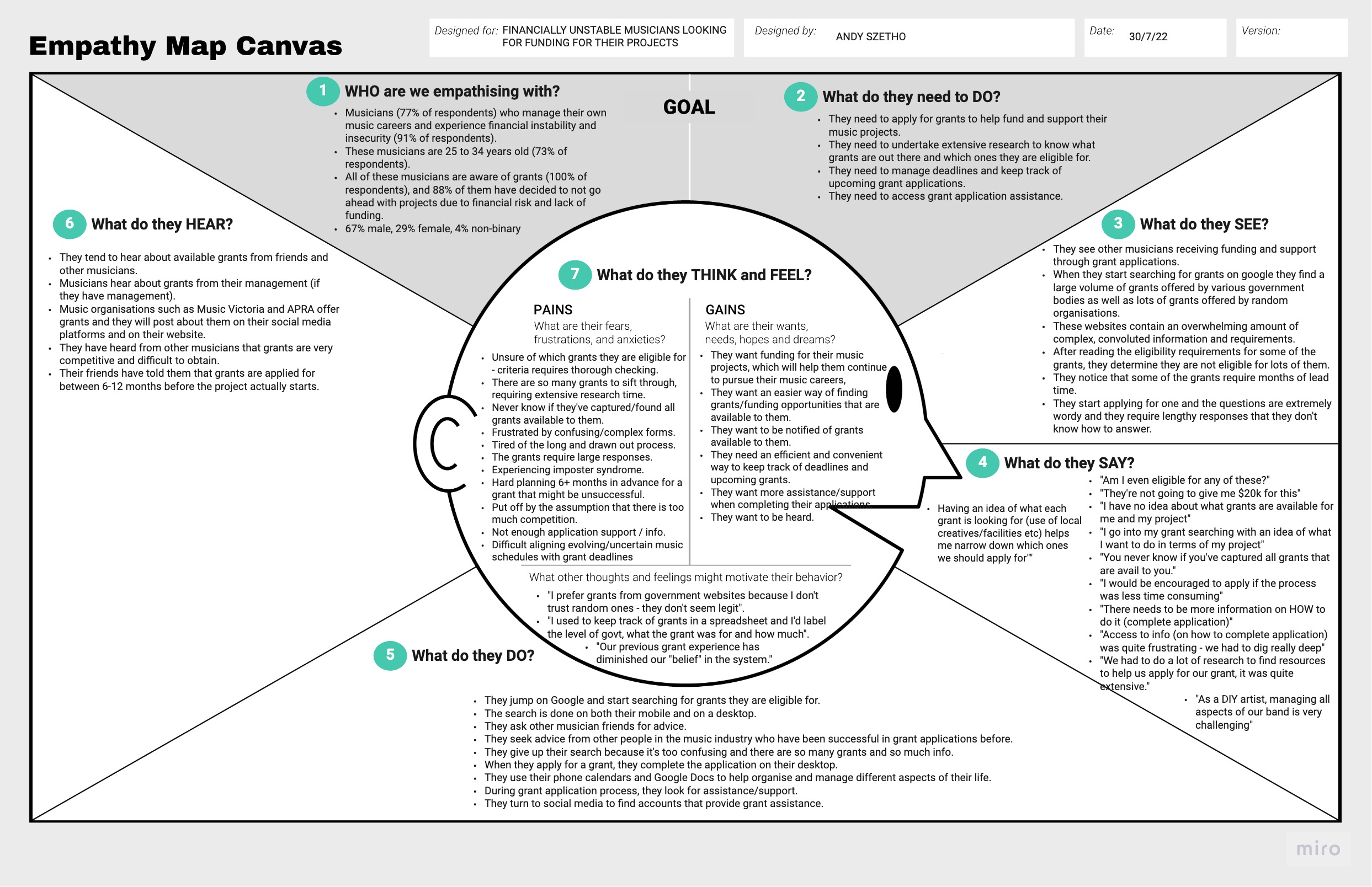
Persona
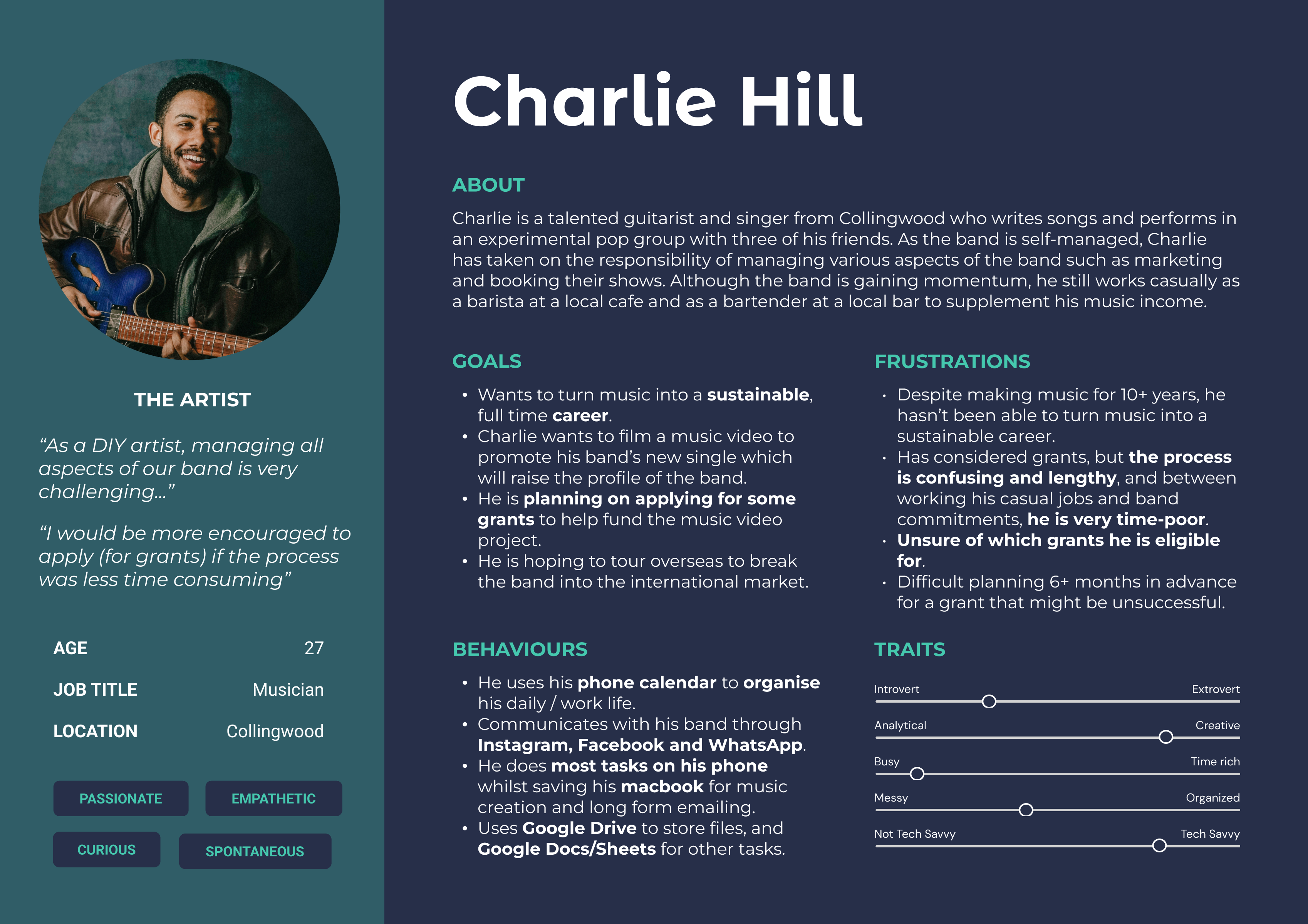
Customer Journey Map
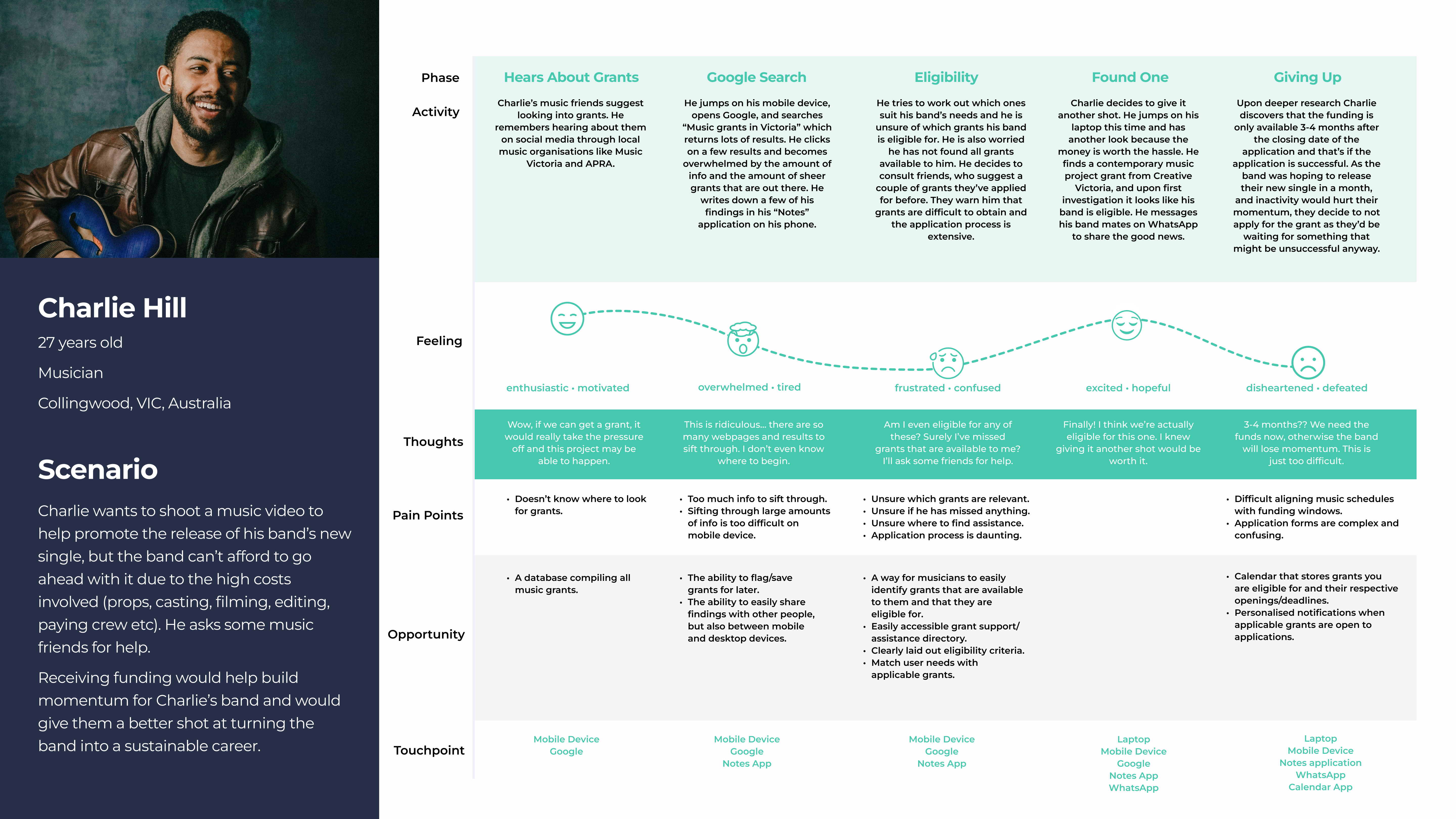
Pain Points
- Eligibility Uncertainty – When searching for grants, Charlie is unsure which ones he is eligible for and he never knows if he’s found all the relevant grants that are available to him.
- Information Overload – The grant searching process requires extensive research time due to the large amount of grants and websites that Charlie has to sift through when he searches for grants on Google.
- Aligning Schedules – Charlie is apprehensive about applying for grants because the grant deadlines don’t usually align with his band’s schedules.
- Daunting Application Process – Charlie is apprehensive about applying for grants because he has heard the application process is complex, confusing and drawn out.
How Might We?
How might we simplify the grant searching process for Charlie?
Ideation
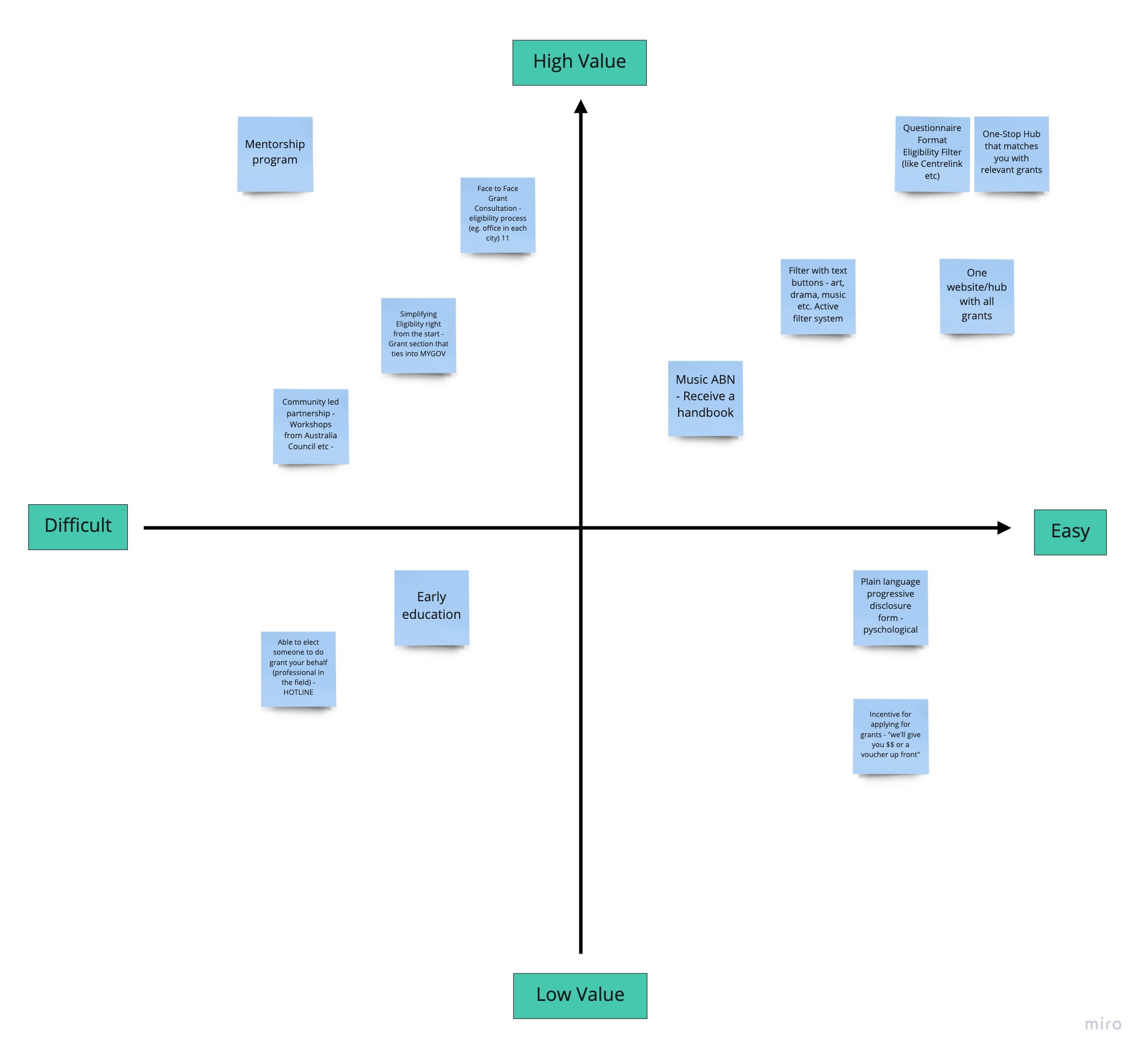
I facilitated an ideation workshop with 5 Charlies. I hosted a Crazy 8 sprint and a group brainstorm session which generated lots of ideas to simplify the grant searching process for Charlie.
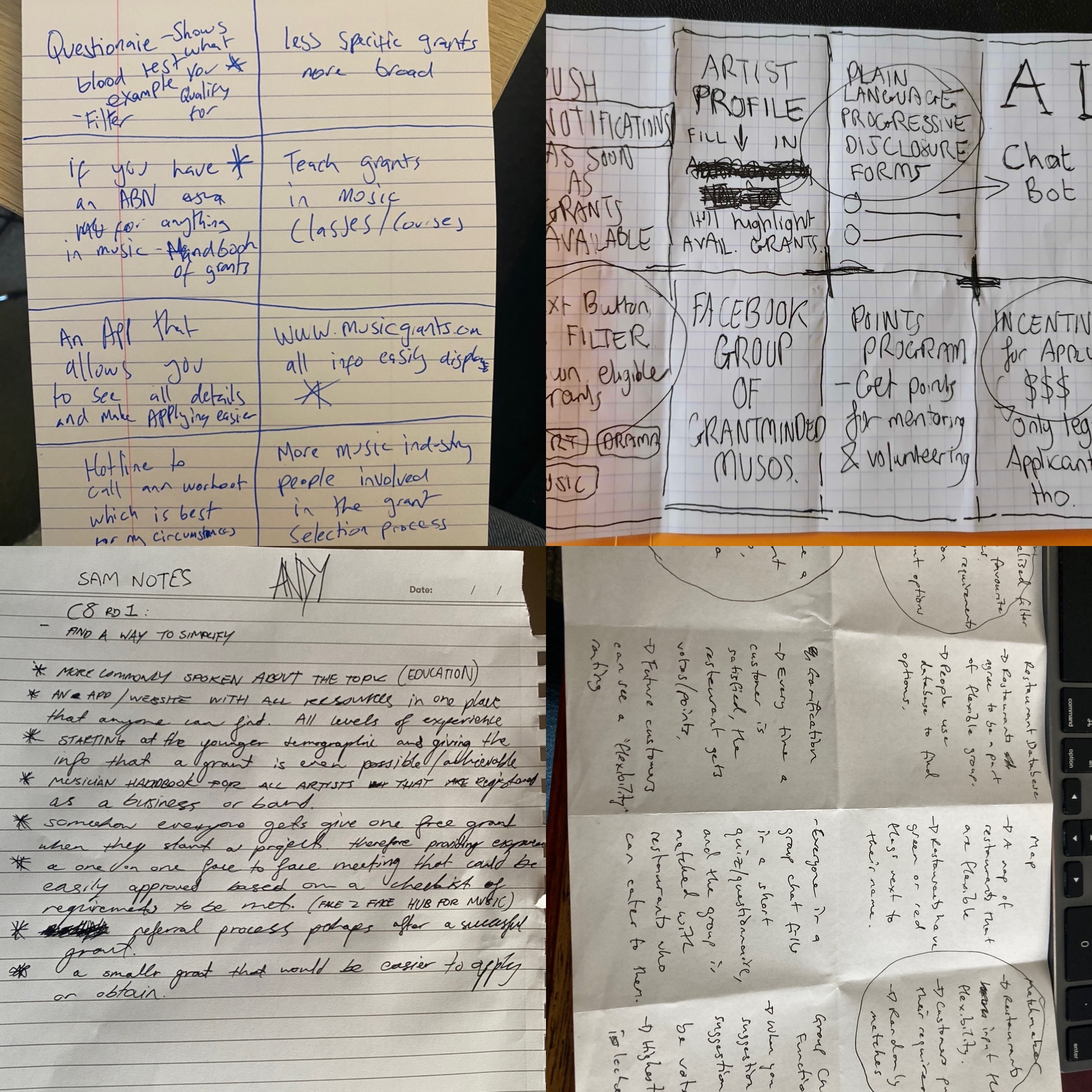
MVP Matrix
The Solution
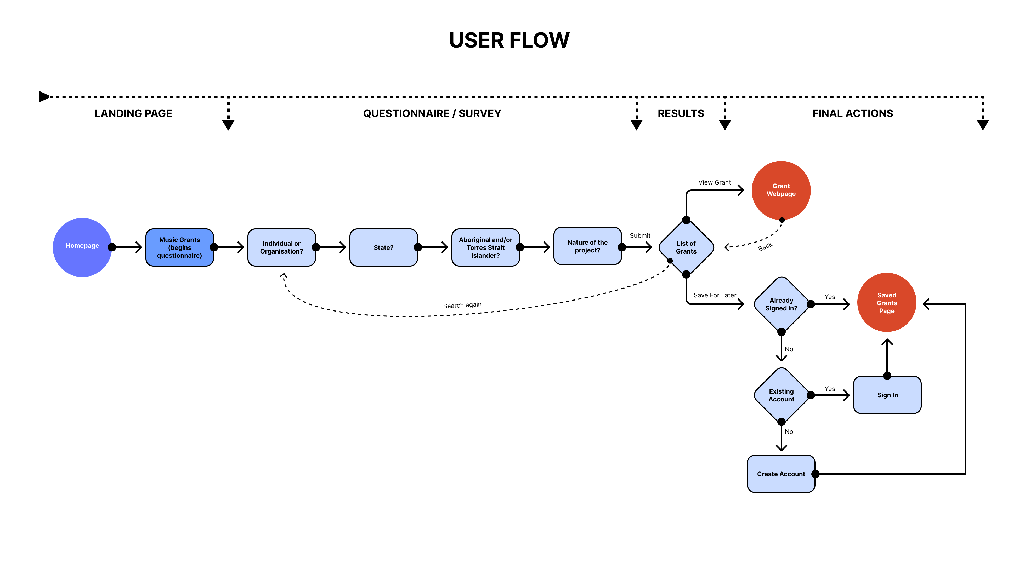
The easy win was a one-stop application that filters grants depending on eligibility criteria implemented as a questionnaire format similar to Centrelink online forms. This solution contains features that would address each of Charlie’s pain points.
There were other ideas such as grant support/assistance that were deemed to be of high value in the ideation workshop. These ideas could be implemented as specific features as they further address Charlie’s pain points.
Additional Desktop Research
As the grant searching application had been decided on, it was now time to think about how this would be implemented.
I did some additional desktop research, looking into the grant eligibility requirements that were mentioned in my 1:1 interviews. This informed the design’s survey questions.
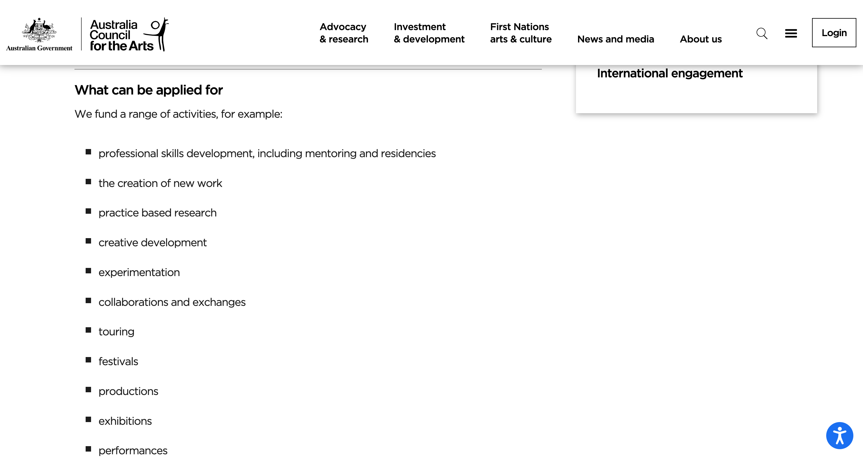
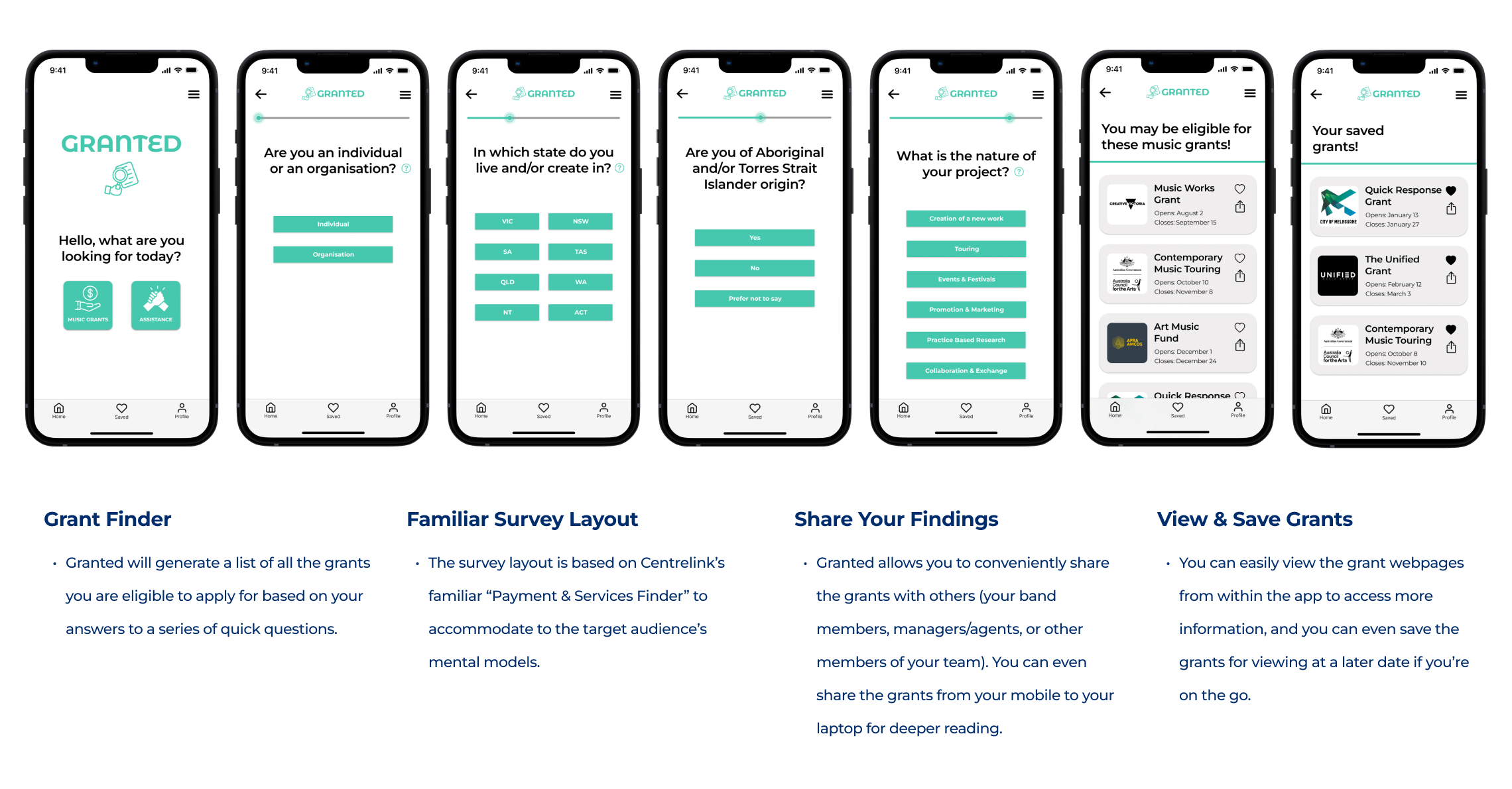
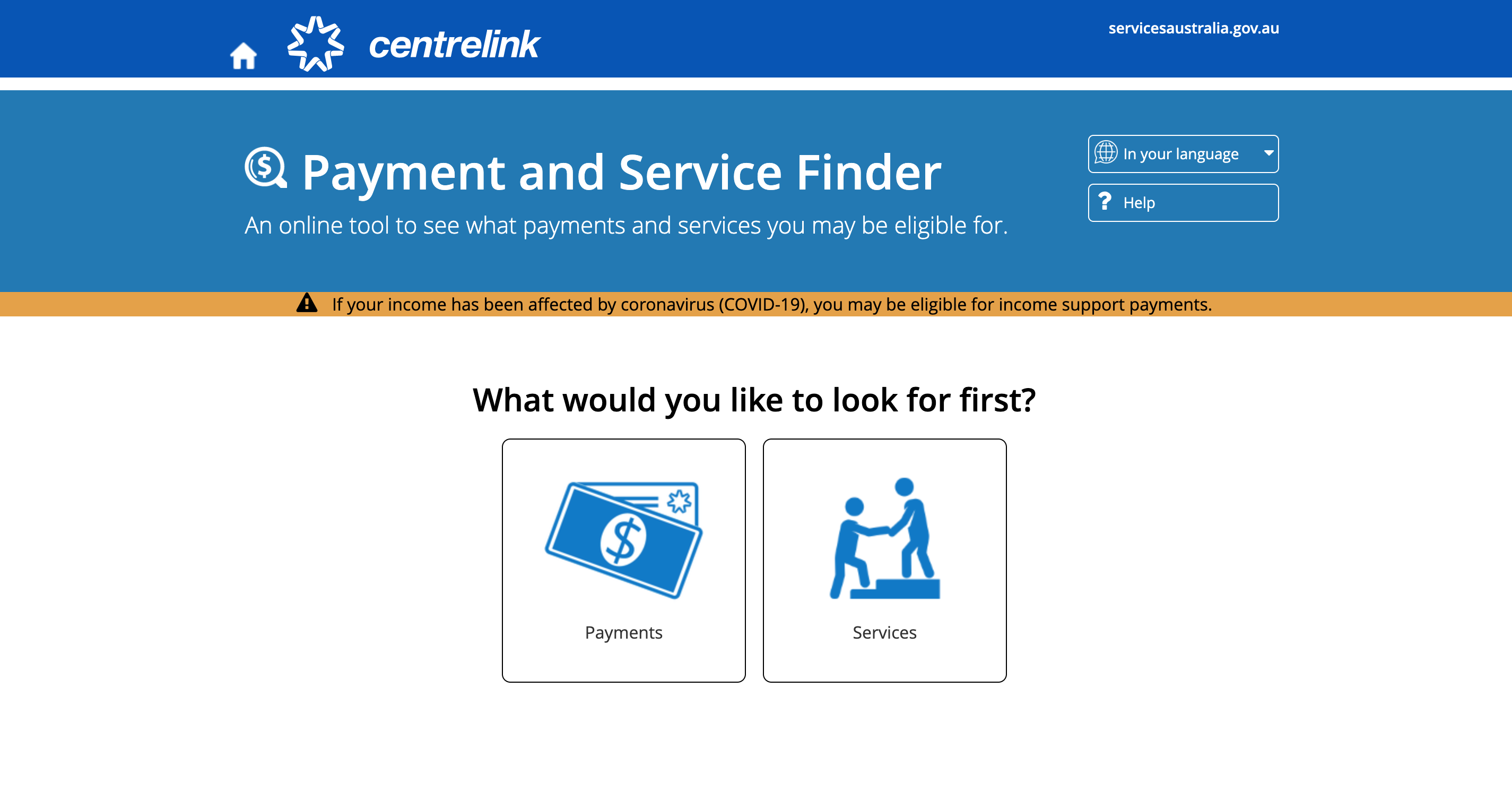
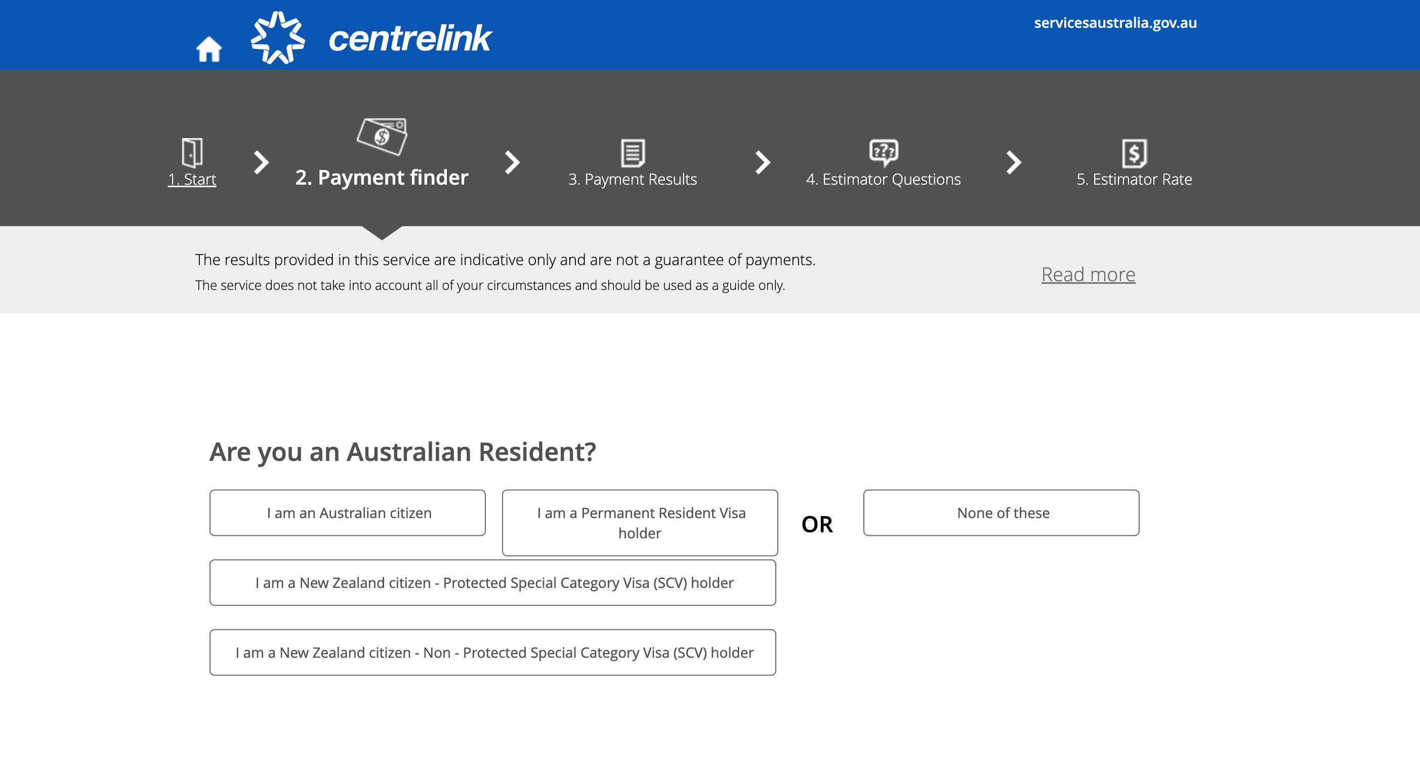
Centrelink’s payment and service finder is simple, clean, and conversational. On the landing page, the user is greeted by two option buttons, making it easy to know where to navigate to depending on what you are looking for. Further questions then cascade down as you move through the survey. At the end of the process, eligible payments/services are generated based on the user’s answers.
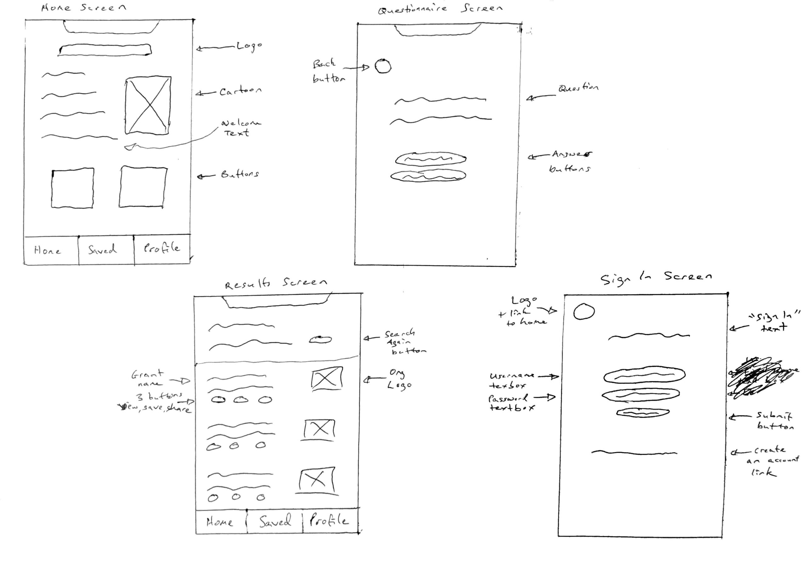
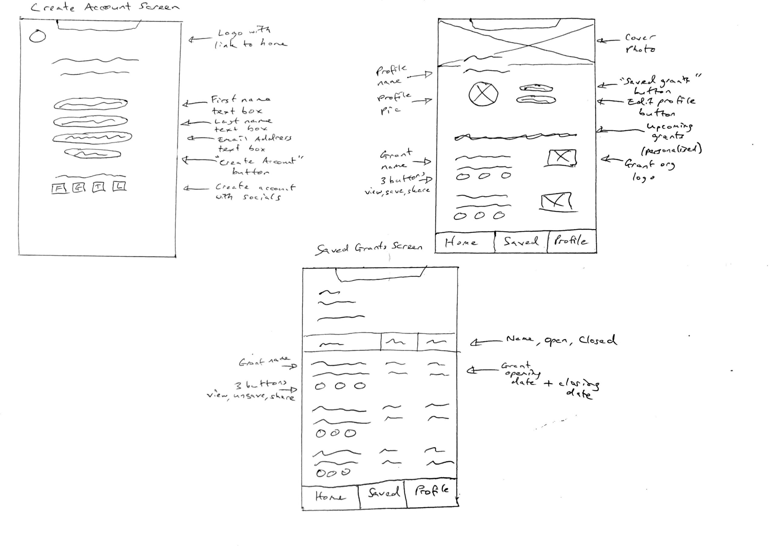
User Flows & Sketches
Wireframes
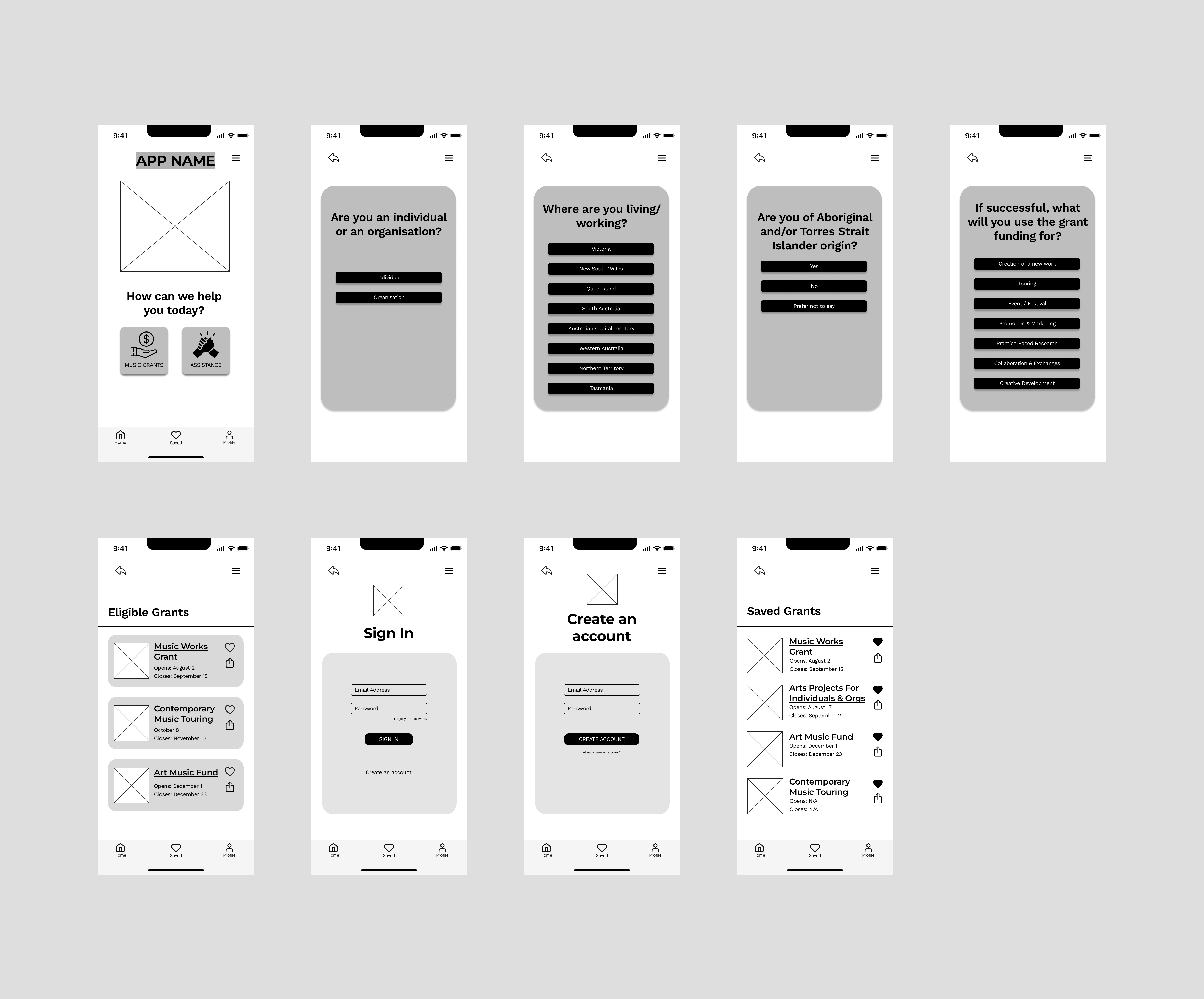
Low → Mid → High Fidelity
Usability Testing
Low Fidelity - 3 tests
The 3 usability tests I undertook for the low-fidelity prototype specifically focused on the wording of the survey questions and answers, and how the Charlies felt upon first impression.
Low Fidelity Results
2/3
Charlies were unsure if "working" referred to music work or non-music work.
1/3
said the wording felt robotic and like you're in a retail store, and another said the questions could be more "to the point"
3/3
felt that 4 survey questions was just right and didn't feel longwinded
Low Fidelity Iterations
The following changes were implemented to the low-fidelity prototype:
- Changing some of the question wording to make it more direct and clear.
- Some of the answer boxes were made smaller so that it wasn’t confronting/information overload.
- Changing some of the wording to create a more personable and less robotic tone.
Mid Fidelity - 5 tests (3 on Zoom + 2 in person)
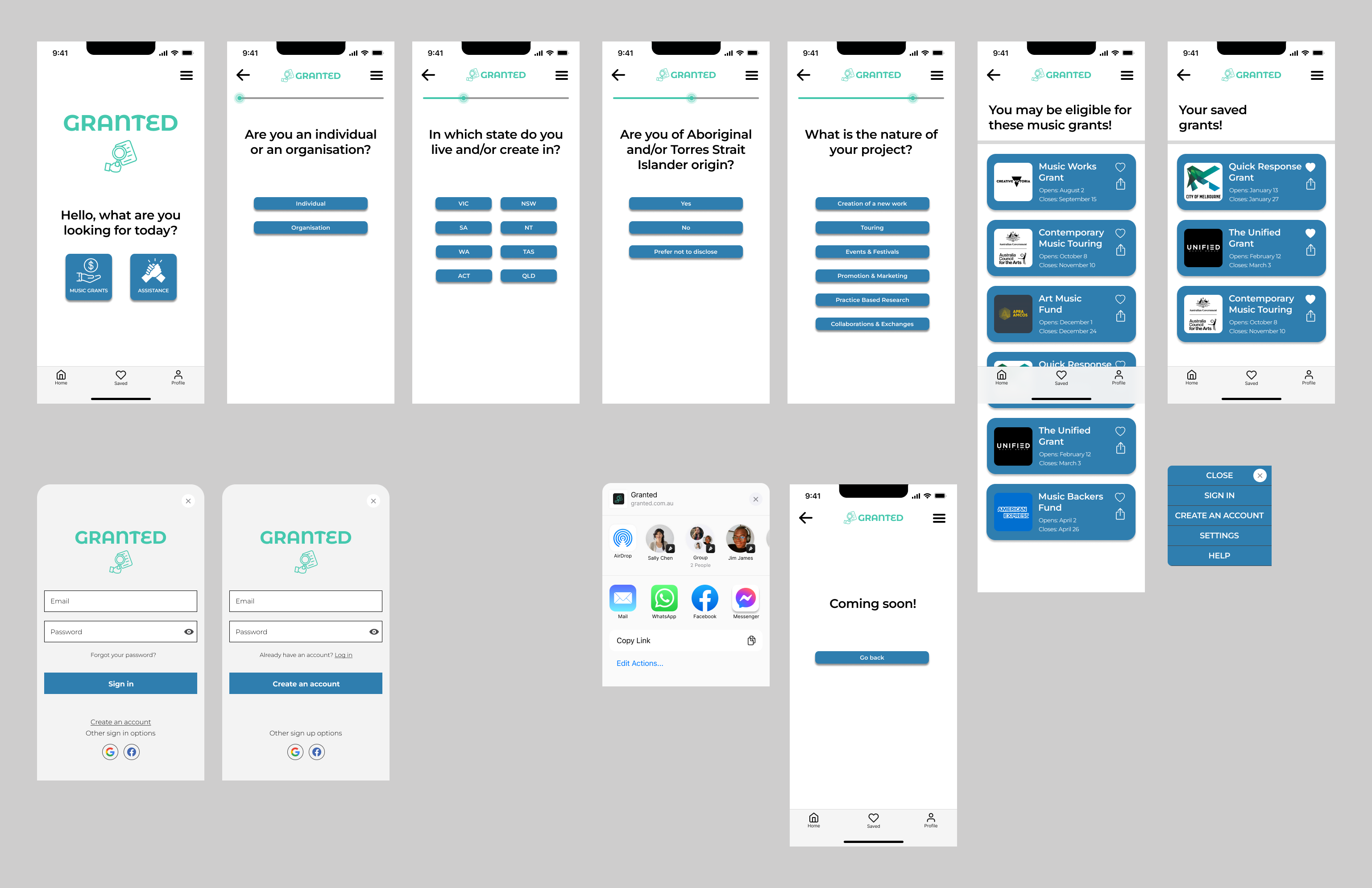
The 5 usability tests I undertook for the mid-fidelity prototype tested all aspects of the app: the navigation and flows, the colour and feel, the understandability and explorability, and the specific buttons and features.
Mid Fidelity Results
5/5
Charlies got stuck at the grant webpage and didn't know how to go back
5/5
Charlies expected the heart to fill rather than take them to the saved page
2/5
said the survey answer buttons were too narrow, making them difficult to read quickly
2/5
required clarification on what "creation of a new work" referred to
1/5
asked if a band counted as an organisation in the survey section
3/5
found the blue harsh, confronting, too serious or too "governmental"
Mid Fidelity Iterations
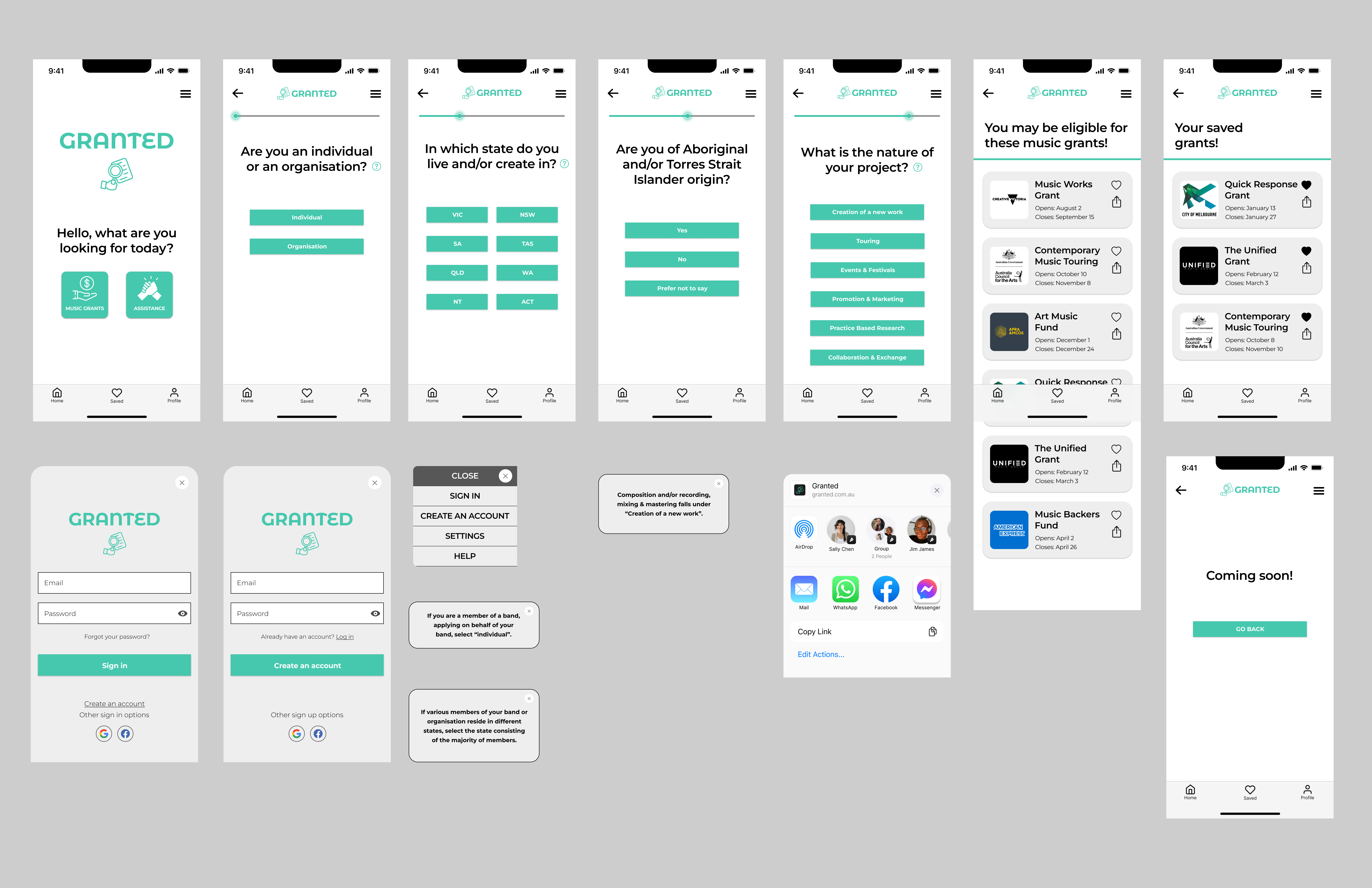
The following changes were implemented to the mid-fidelity prototype:
- The blue colour was changed to the green, making the overall feel of the app more consistent and less serious.
- The grant webpages were turned into an in-app overlay rather than an external webpage. The grant webpages also have a close button, refresh button, a copy button, and a share button.
- There is an info bubble button which pops up if users require more clarification when answering the questions.
- The heart icon now fills when clicked, and it doesn’t take the user to the “saved grants” page when clicked.
- All of the buttons now feature squared edges for consistency.
Grant Finder
Granted will generate a list of all the grants you are eligible to apply for based on your answers to 5 quick questions. You can rest assured that you haven’t missed any grants that are available to you.
View & Save Grants
You can easily view the grant webpages from within the app to access more information, and you can even save the grants for viewing at a later date if you’re on the go.
Share Your Findings
Granted allows you to conveniently share the grants with others (your band members, artist managers/agents, or other members of your team). You can even share the grants from your mobile device to your laptop for deeper reading.
Design Decisions
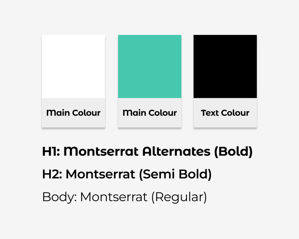
Colour: Green was chosen due to its connotations with money, health and its sense of calm. Instead of going with a traditional green which reminds people of trees and nature, I wanted the Granted green to feel modern and more technology-oriented, which I think this green achieves. During the mid fidelity stage I had a blue as well as the green, but my usability test participants said it felt too serious or “governmental”, which made sense because I used the Centrelink website as a reference. I ended up removing the blue and leading solely with the green.
Font: Montserrat is simple, clean, and it feels contemporary. This was an intentional choice as my primary users will be musicians or arts practitioners who are constantly surrounded by creativity and cutting-edge design. I wanted a font that encourages these themes.
Addressing
The Pain Points
Eligibility Uncertainty
Solution:
Granted will generate all grants available to Charlie based on his answers to the eligibility survey. This will eliminate Charlie’s concerns that he has missed grants he is eligible for.
Information Overload
Solution:
Charlie will be able to view all grants available to him immediately after completing the eligibility survey, significantly reducing time spent sifting through large volumes of Google results and grant information. Granted will do the searching for him.
Aligning Schedules
Solution:
Granted will show Charlie which grants are available to him, which ones are coming up soon, and when their deadlines are. This will allow Charlie to plan ahead in order to align his schedules with grant openings/deadlines.
Daunting Application Process
Solution:
Granted will have an assistance feature with tips and advice on applying for grants. I haven’t created screens for this feature yet due to time constraints, but it will be the next action.
Next Steps
- Assistance & Support Services – This was a feature that was deemed to be of high value for Charlie in the ideation workshop.
- Face to Face Consultation & Mentoring Program – Another feature that the Charlies deemed to be highly desirable in the workshop.
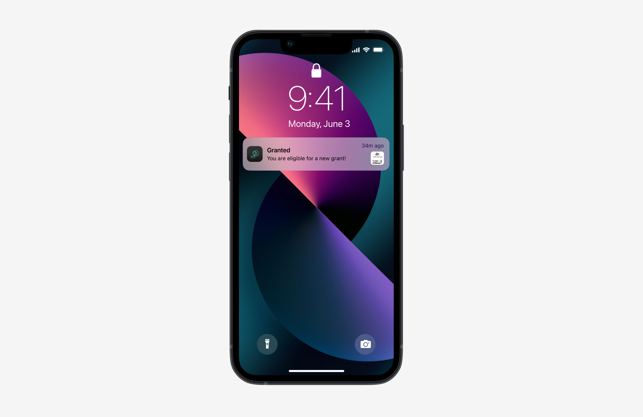
- Personalised Profile & Push Notifications – once an account has been set up, Charlie only has to complete the eligibility survey once, and whenever a new grant becomes available, Charlie will be notified. This was also from the ideation workshop.
- More High Fidelity Usability Testing & Iteration – Iteration never stops. User needs evolve with the changing times.
